Full Brand Development
Mayflower Farms
Identity Keywords:
Organic - Fun - Floral
Full Brand Development
Mayflower Farms
Identity Keywords:
Organic - Fun - Floral

Distinguishing a Startup in a Saturated Market
Mayflower Farms came to market during the 2020 gold rush in the cannabis industry. Although they were one of the first licensed growers in Texas, that still put them several steps behind the states that had issued licenses well before Texas. They possessed important distinction, however. Mayflower Farms provided a product that was wholly organic.
After consulting with the owners, we determined that the best course of action was to target two specific niche markets: the elderly and the health conscious. In an industry that's awash with edgy, youthful brand identity, their brand would take the unique approach of conservative yet artful design.

Grass Roots Design Concepts
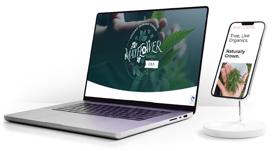
The colors green and coral were selected to reflect the earthy, organic nature of the businesses, and the supporting graphics are timeless floral patterns. This fun and inviting approach was designed to be evocative of health conscious supplement products while still clearly conveying the unique positioning of Mayflower Farms in its industry.

