

01 / The brand
Expanding a target audience.
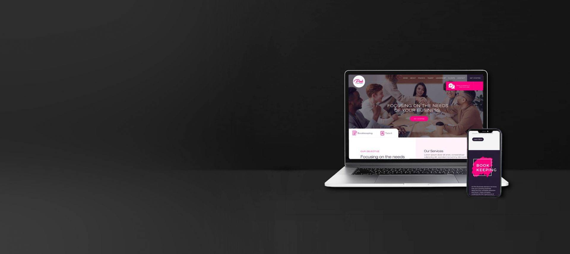
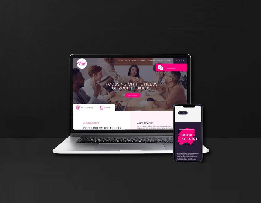
During our preliminary brand consultation, the owner of Pink conveyed that many of her male clients thought at first her business only served women. Considering that the bulk of her clients were men, this became the primary task of her rebrand. Changing the name was not an option, so it was time to find a creative solution. The gap between her very feminine design aesthetic and her male customer base was bridged through an iconic accessory: the pink tie.
We were able to deliver the feminine, elegant design style that she required while still creating a strong, inclusive brand identity.

02 / Brand in action
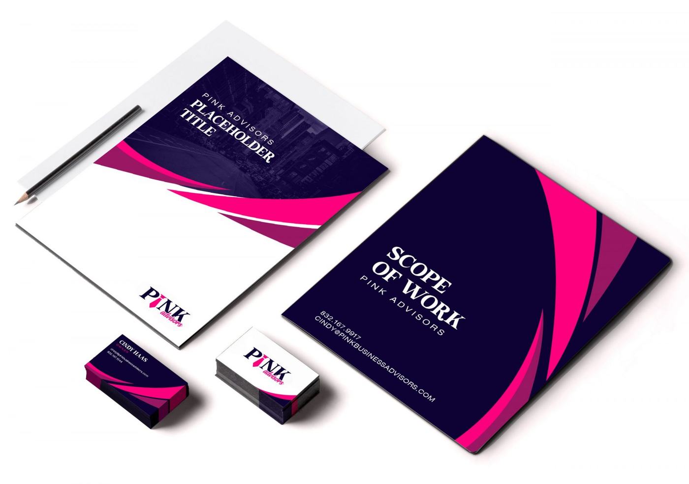
Branded correspondence.
One of the owner’s primary concerns was the stress involved in a rebrand across all of her existing print collateral. Considering the large amount of paperwork associated with her business, a complete redesign of all existing print media was included. Business cards, folders, flyers and more were designed to support the announcement of her rebrand.
Your next move
Does your brand match your work?
Book a free consultation and we’ll take an honest look at how your business shows up today.